Concept & Art Direction
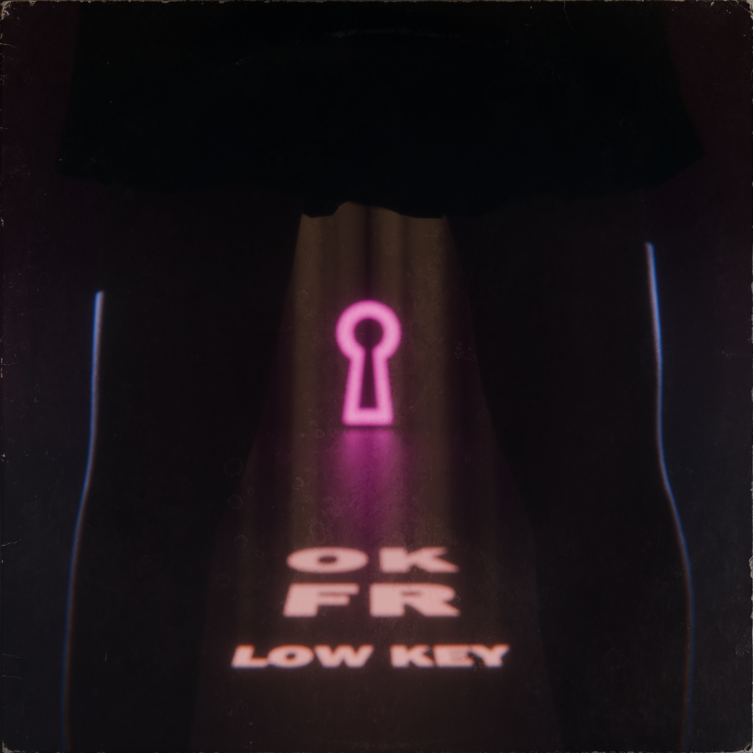
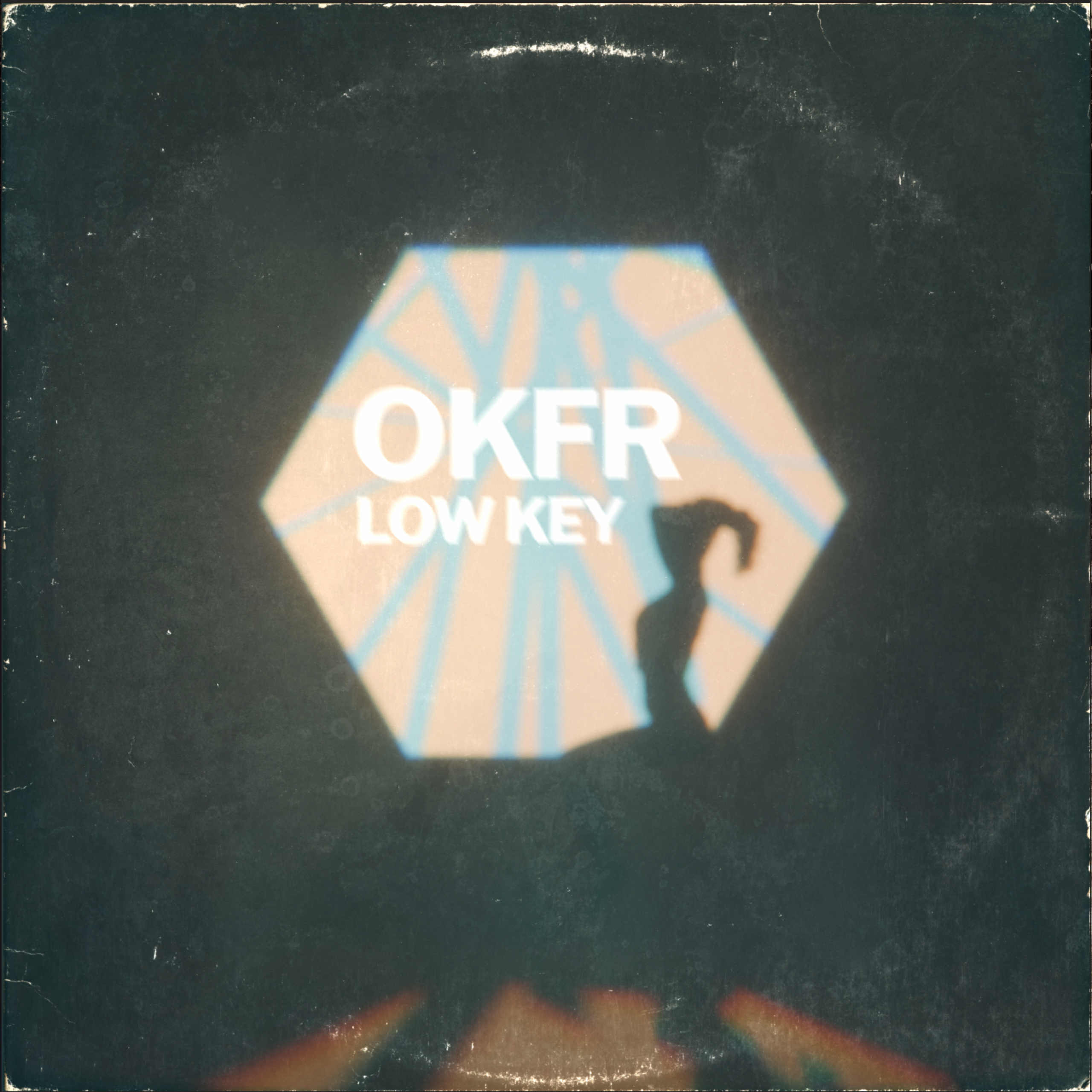
I recently developed the artwork for Low Key by OKFR, an EDM release defined by a dark and aggressive production style and a contrasting soft but confident female vocal lead. The creative direction I chose centered on the title’s suggestion of remaining casual and below the radar, translating that idea into an intentionally simple and understated visual environment.
Working with creative input from the artist, I explored a direction that represented the female presence with strength, while using light to avoid making it the immediate focal point. Rather than relying on bold and bright imagery, the composition uses ambiguity, shadow, and atmosphere to create balance between what is seen in it’s art and what is heard.
3D & Image-Making
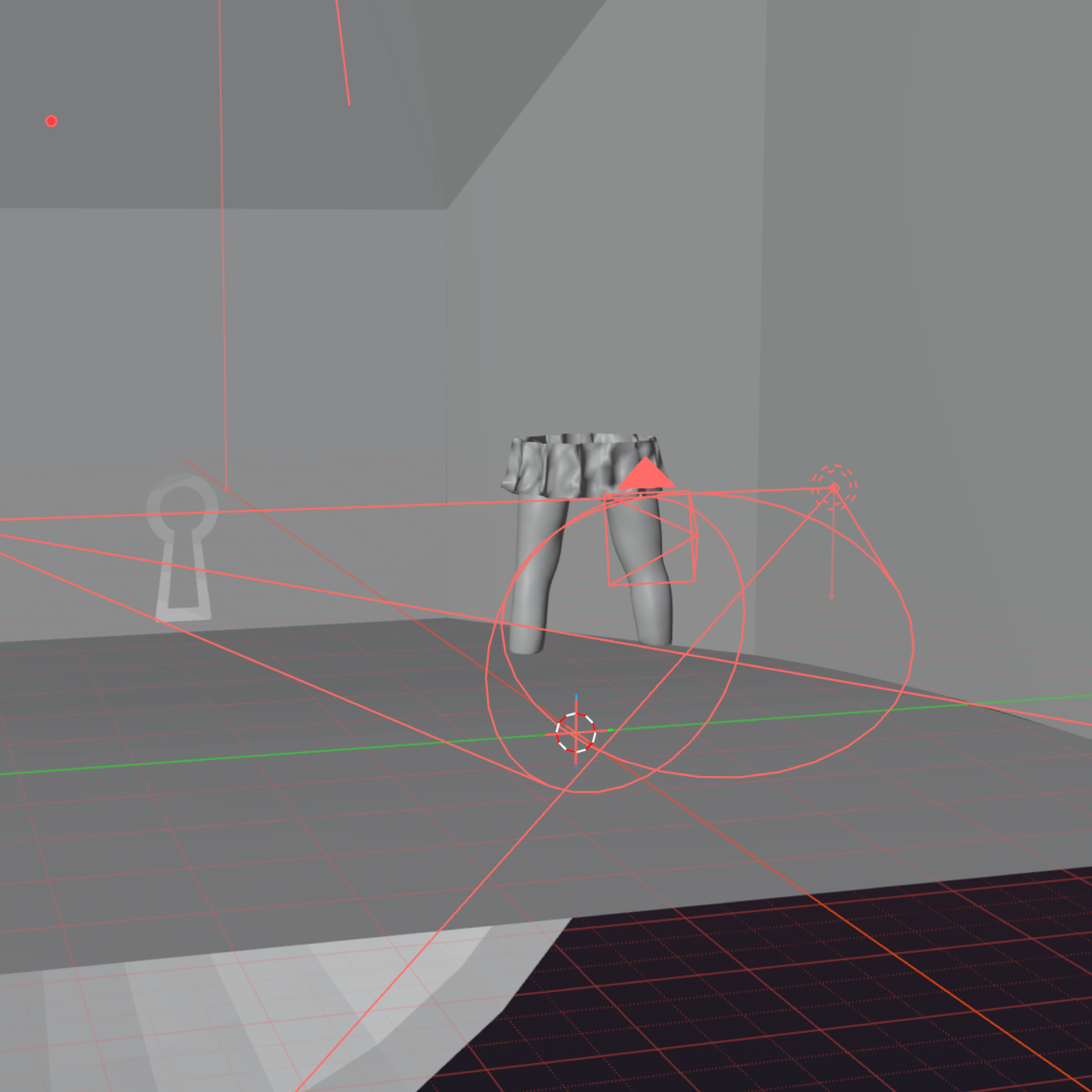
I knew from the beginning of the process, following our initial conversations, that the solution would involve a dark energy to the scene contrasted by light sources. My first drafts were more straight forward in design, but more ambiguous in design. I tested implementation of a full female silhouette in a simple cubed environment, testing various cutouts and poses with an abstracted light source behind. As fond as I was of the first design and it’s color palette, I found it was a little too simplistic in it’s representation of it’s concept. I saw the direction I felt necessary to move in, but the challenge was balancing the lighting with enough contrast to preserve the environment’s depth and reveal its essential details without compromising the subdued atmosphere.
Typography in 3D Space
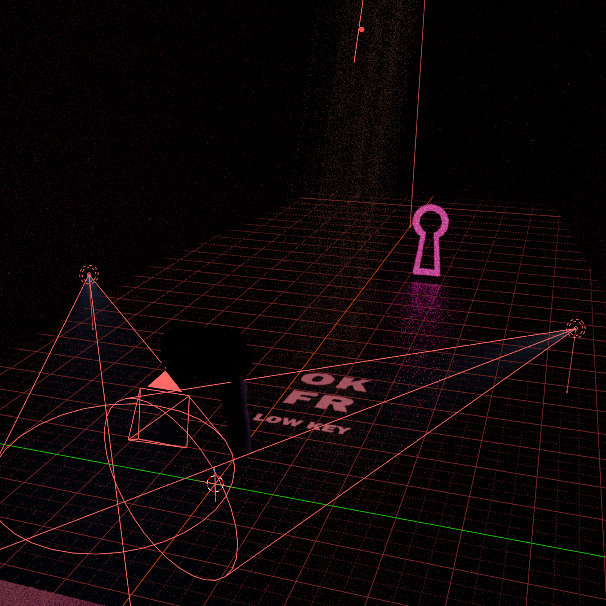
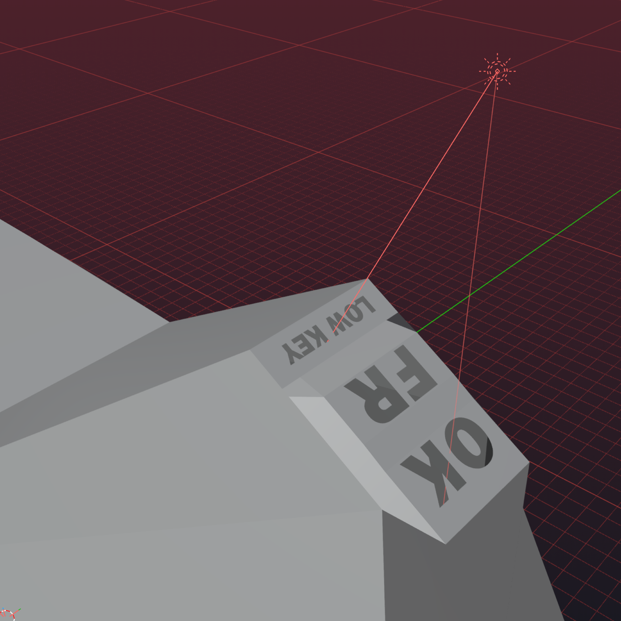
The lighting process led me to an idea I wanted to explore: rather than compositing the typography in Photoshop, why not integrate it directly into the scene using the light sources themselves?
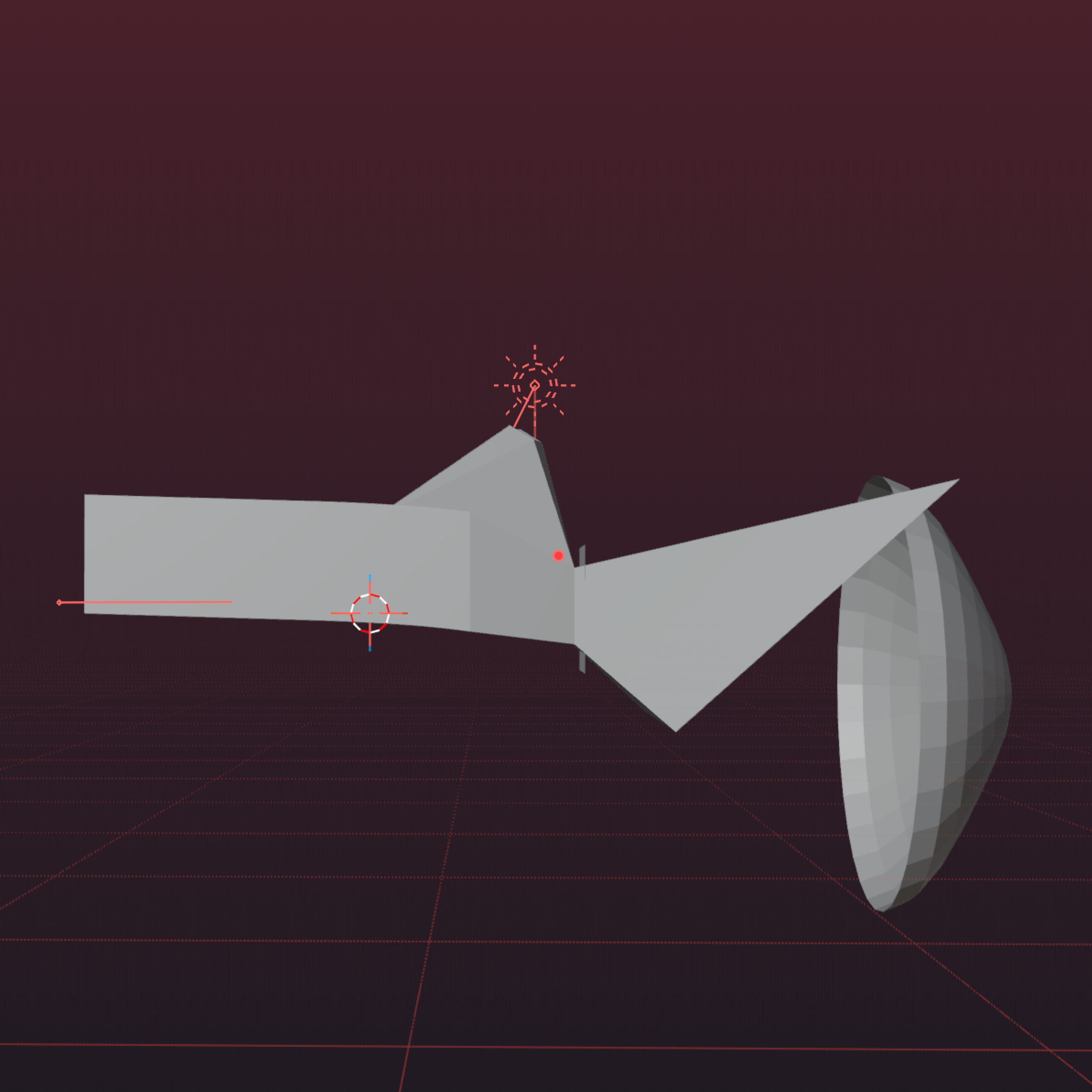
Coming to a final solution took a fair amount of trial and error. My initial tests produced largely illegible text, while the light beams and text cutouts themselves remained too visible near the top of the scene. To resolve this, I created a secondary section of geometry above the main space, separating the light source and it’s casting box from the visible environment. By cutting the typography into this form and fine-tuning the lighting, I was able to project the text onto the floor in a way that felt natural to the scene without overpowering the darkness of the scene.
Finalization & Outcome
The final composition was rendered and exported in a high resolution, enough for the possibility of print production as a preemptive measure. I took this final export into Adobe Photoshop for refinement through light color grading and far more subtle texture overlay, introducing a slightly aged finish to the rendered scene that wasn’t too on the nose for digital album art. I found that the second iteration of the piece better suited the tone of the song, and better aligned with the artists vision.
This project provided an opportunity to bring my 3D practice into a long dreamed of music-design context, combining environmental modeling, lighting, and compositing into a finished piece of artwork for a release that I genuinely connect with as a listener.